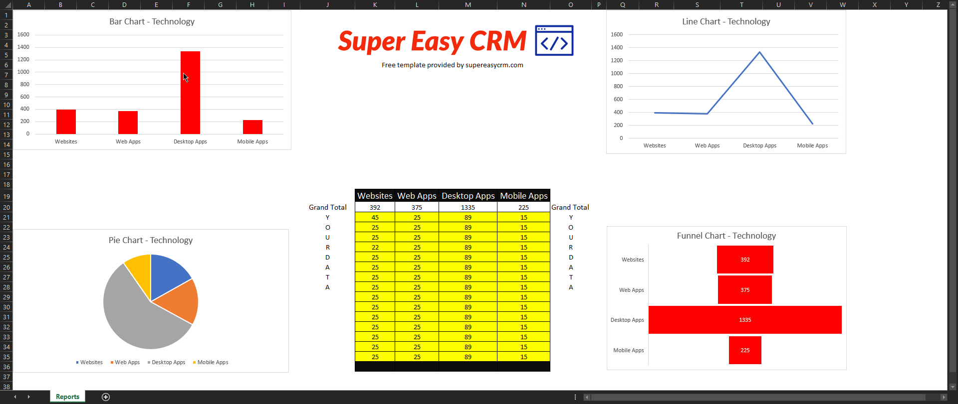
Pie, Bar, Funnel, and Line charts with Excel

Author: Matt Irving
Published:4/14/2021
Create Professional Excel Reports
Turn rows of unsightly data in a stunning graph! Data can tell a really good story if you pair it with the right visual aids.
This prebuilt template can take your data and create either a Pie, Funnel, Line or Bar chart.
To add your data follow the steps listed below.
- Insert your data into the yellow area in the table.
- Add additional rows of data by inserting rows into the table.
- Add additional columns by inserting columns into the table.
- Feel free to swap our logo out with yours. There is no need to attribute anything to us but sharing with a colleague would be appreciated!